By the Deb Paton Showley Group
There is something about a lake home that calls for a specific kind of color story. The light moves differently here, the view changes with the seasons, and the atmosphere you are trying to create sits somewhere between relaxed and refined. Whether you own a getaway on Lake Tippecanoe, a year-round retreat on Lake Wawasee, or a weekend escape on Winona Lake, the interior palette you choose sets the tone for every room before a single piece of furniture is placed.
Choosing paint colors for a lake home is not the same as choosing them for a primary residence in the suburbs. You are working with natural light that reflects off the water, wood-heavy architectural elements that need complementary tones, and a mood that should feel like a serene escape the moment you walk through the door. Get the palette right, and every interior photo looks like a design magazine spread. Get it wrong, and even the most beautiful lakefront view can feel disconnected from the space inside.
The good news is that the lake home aesthetic has a clear visual language, and the paint colors that serve it best are well-established across a range of styles, from rustic Kosciusko County cabins to contemporary open-concept lake houses. Here is what you need to know.
Key Takeaways
- Lake home interiors perform best with palettes drawn from the water, shoreline, and surrounding landscape.
- Soft whites, warm greiges, and muted blues are the most versatile foundation colors for any lake home style.
- Darker, nature-inspired tones work well in accent spaces and create a cozy atmosphere in the right rooms.
- Undertones matter more in lake homes than in other settings because of the constantly shifting natural light coming off the water.
- Finishing touches like trim color and ceiling treatment can dramatically elevate the impact of your main wall color.
Why Paint Color Works Differently in a Lake Home
Before you pull any chips from the hardware store, it helps to understand why lake homes present a unique set of conditions for color selection. The light that reflects off a lake surface is cooler in tone than direct sunlight, and it shifts throughout the day in ways that can make the same wall color look completely different at 7 a.m., noon, and dusk. A color that looks like a soft sage in the showroom can appear almost gray by the water on an overcast afternoon, and a white that reads as clean might turn faintly purple at the golden hour near the lake.
This is why undertones are everything in a lakefront setting. You are not just picking a color; you are selecting how that color is going to behave across a full spectrum of lighting conditions. Warm undertones — those in the yellow, beige, and peach family — tend to hold their character well even in cooler light. Cool undertones in the blue and green family can deepen beautifully in certain lake settings but require more careful testing before committing.
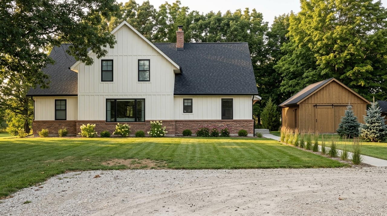
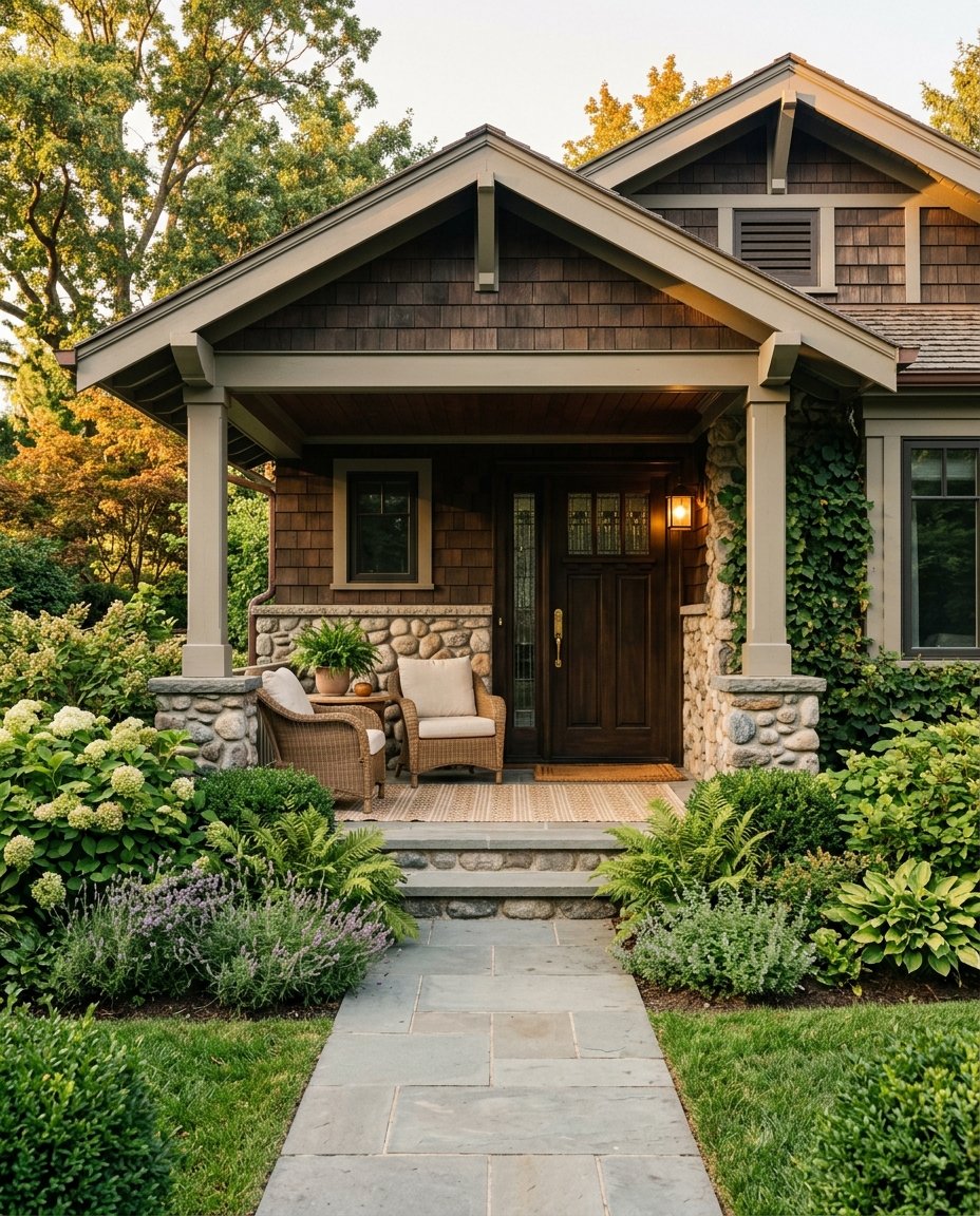
The architectural character of Kosciusko County lake homes also plays a role. Many properties on Lake Wawasee and Lake Tippecanoe have exposed wood beams, cedar ceilings, shiplap walls, or stone accents that anchor the interior palette. Your wall color needs to complement those fixed elements rather than compete with them.
This is why undertones are everything in a lakefront setting. You are not just picking a color; you are selecting how that color is going to behave across a full spectrum of lighting conditions. Warm undertones — those in the yellow, beige, and peach family — tend to hold their character well even in cooler light. Cool undertones in the blue and green family can deepen beautifully in certain lake settings but require more careful testing before committing.
The architectural character of Kosciusko County lake homes also plays a role. Many properties on Lake Wawasee and Lake Tippecanoe have exposed wood beams, cedar ceilings, shiplap walls, or stone accents that anchor the interior palette. Your wall color needs to complement those fixed elements rather than compete with them.
What Affects Paint Color Performance Near the Water?
- Natural light coming off the lake is cooler and more diffuse than direct sunlight, which affects undertone perception throughout the day.
- Wood-heavy interiors with warm tones in cedar, pine, or oak call for wall colors that do not clash with those organic hues.
- Open floor plans, which are common in lake homes, mean that a single color often carries across multiple connected spaces and needs to hold up at every angle.
- Humidity and moisture levels can affect sheen; semi-gloss and satin finishes are often better suited to lake homes than flat paint.
- The view itself is part of the color palette; the colors inside should frame and complement what is visible through the windows.
The Best Foundation Colors for Lake Home Interiors
The most enduring lake home interiors tend to start with a neutral foundation and build from there. These are not cold, sterile neutrals but warm, living tones that feel like they belong in the landscape. Soft whites with warm undertones are one of the most versatile starting points.
Warm greiges — the hybrid of gray and beige — have become a go-to for lake homes precisely because they read as calm without being cold. They pair well with natural wood elements and tend to look cohesive across different lighting conditions. For homeowners who want to lean more directly into the water-adjacent aesthetic, soft blue-greens and dusty aquas translate the view inside without overwhelming it.
Warm greiges — the hybrid of gray and beige — have become a go-to for lake homes precisely because they read as calm without being cold. They pair well with natural wood elements and tend to look cohesive across different lighting conditions. For homeowners who want to lean more directly into the water-adjacent aesthetic, soft blue-greens and dusty aquas translate the view inside without overwhelming it.
Top Foundation Colors Worth Testing in Your Lake Home
- Sherwin-Williams Alabaster brings warmth without tipping into ivory, making it an excellent choice for open-concept spaces with natural light on multiple sides.
- Benjamin Moore White Dove is a soft white that reads as clean and airy while maintaining enough warmth to feel comfortable rather than clinical.
- Sherwin-Williams Accessible Beige holds a perfect balance between greige and neutral, performing well across changing light conditions throughout the day.
- Benjamin Moore Revere Pewter adds a touch of depth to a neutral palette and pairs beautifully with wood tones common in Kosciusko County lake homes.
- Sherwin-Williams Watery translates the color of a calm lake surface into an interior tone without feeling overly saturated or themed.
Accent Colors That Elevate the Lake Home Look
Once you have a foundation color in place, the accent palette is where you can bring in more personality. Deeper blues in the navy and indigo range are a natural complement to the water-facing aesthetic and can be used in bathrooms, accent walls, mudrooms, or on cabinetry for a grounded, intentional look.
Soft greens in the sage and eucalyptus range connect the interior to the shoreline landscape and work especially well in bedrooms and reading rooms where you want a calm, restorative atmosphere. Dusty, muted versions of these tones perform better than saturated ones in most lake home settings. These have a quality that feels like the woods at the edge of the water.
For lake homes with a more rustic character, deep terracottas, warm charcoals, and iron-toned blacks can serve as sophisticated accent tones. When used on trim, in a powder room, or on a fireplace surround, these colors bring drama without disrupting the overall calm of the palette.
Accent Color Combinations That Work Well Together
- Navy or indigo on cabinetry with warm white walls creates a high-contrast, classic lake home palette that photographs beautifully.
- Sage green walls in a bedroom paired with natural linen and white trim feel grounded and serene, which is exactly the atmosphere a lake retreat should offer.
- Charcoal or near-black accents on doors and window trim sharpen a soft neutral palette and give the home a more finished, editorial look.
- Warm terracotta as a single accent wall in a dining room or kitchen adds depth without overwhelming the openness of the floor plan.
- Muted dusty blue-green in a bathroom or laundry room is a low-commitment way to bring the water palette into a secondary space.
Getting the Details Right: Trim, Ceilings, and Transitions
The wall color is only one piece of the picture. Trim, ceilings, and the transitions between spaces can make or break a paint scheme in a lake home, especially when open floor plans mean that multiple colors are visible at once. A crisp, bright white trim is the most reliable choice in lake homes because it creates a clean frame around your wall color and prevents the palette from feeling muddy or unresolved.
Ceilings deserve more attention in lake homes than they typically receive. Many lake properties have cathedral ceilings, exposed beams, or wood planking overhead, and these architectural features become focal points. If you have a wood-planked ceiling, leaving it natural and choosing your wall colors accordingly is usually the strongest move. If your ceilings are standard drywall, painting them the same tone as your walls but in a slightly lighter value creates a cohesive, enveloping effect.
In homes with multiple rooms visible from a central living area, carrying a single neutral tone through the connected spaces and using accent colors only reduces visual noise and keeps the floor plan feeling unified.
Key Details That Pull the Paint Scheme Together
- Crisp white trim in a bright or warm white tone creates visual definition between wall color and architectural elements.
- Matching wall and ceiling color in the same tone at different values gives lake home interiors a calm, intentional feel.
- Using a consistent floor stain tone across open-plan spaces helps the wall colors read as a cohesive palette rather than a collection of separate rooms.
- Semi-gloss or satin finishes on trim and cabinetry hold up better to lake humidity than flat finishes and are easier to clean.
FAQs
What Paint Colors Work Best for a Lake Home in the Midwest?
Midwest lake homes like those on Lake Wawasee, Lake Tippecanoe, and Winona Lake tend to have a mix of rustic and transitional architectural styles. Warm whites, greiges, and muted blue-greens are the most versatile starting points. They complement wood-heavy interiors and look their best in the natural light conditions common to northern Indiana lake properties across all four seasons.
Should Lake Home Interiors Be Painted Lighter or Darker?
Most lake homes benefit from lighter foundation tones in the main living areas, which keeps the spaces feeling open and connected to the outdoor views. Darker tones work well in secondary spaces like bathrooms, bedrooms, and mudrooms. The key is contrast; using both light and dark tones strategically creates visual interest without making the home feel heavy.
How Do I Choose Paint Colors That Work With Wood Beams and Ceilings?
Start by identifying the undertone in your wood. Most lake home wood elements, including cedar, pine, and knotty alder, have warm orange or yellow undertones. Choosing wall colors with warm or neutral undertones prevents the wood and wall from clashing. Avoid cool gray tones near warm wood unless you are intentionally creating contrast, and always test paint samples in the actual space before committing.
What Is the Best Sheen for Lake Home Interiors?
Eggshell is the most popular sheen for lake home walls because it is easy to clean and holds up to moisture better than flat paint. Satin works well in kitchens, bathrooms, and other high-traffic areas. Semi-gloss is the standard for trim and cabinetry. Avoid flat paint on walls in lake homes unless you are working with a very low-traffic space; the humidity and condensation common near water can make flat paint difficult to maintain.
Your Lake Home Palette Is Worth Getting Right
The right paint palette does not just make a lake home look better in photos; it shapes how the space feels every time you walk inside. In Kosciusko County, where lake living is woven into the rhythm of the year, getting the interior right means creating a space that holds its character across all four seasons.
Our team at the Deb Paton Showley Group knows Kosciusko County lake homes inside and out, and we are here to help you make the most of every square foot. Whether you are buying, selling, or preparing your property to list, connect with us to get started.
Our team at the Deb Paton Showley Group knows Kosciusko County lake homes inside and out, and we are here to help you make the most of every square foot. Whether you are buying, selling, or preparing your property to list, connect with us to get started.